
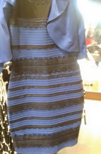
Gold and White… or Blue and Black… this dress is one color for you and the other color for 50% of the population
This picture went viral when it was posted on Tumbler along with the question, “.. is this dress white and gold, or blue and black?” Everyone who viewed the dress thought that the question was silly. For half of the people the answer was unequivocally gold and white. The other half were equally sure that the dress was blue and black.
Personally, I first saw it as gold and white. I couldn’t understand how anyone could see anything else. Then I came back from being in a dark room, and the picture had magically changed. The dress was definitely blue and black.
There are great explanations of why different people see different colors. I particularly like Wired‘s discussion of the science behind the different color perceptions. They even analyze the strengths of the different hues in each part of the dress and come up with a “scientific” answer.
However, as a web designer, I don’t need a right or wrong, definitive color ruling. I don’t think there is a single correct answer.
The whole discussion illustrates one of the problems I explain to clients. You cannot control precisely what a visitor to your website will see.
The dress photograph shows that people simply perceive things differently. The same swatch of color may look red to you and green to me. The settings of our individual monitors may differ. The background images on our monitors may contain different colors that affect our judgements. Our room lighting may be lighter or darker, or more blue or yellow. Or, our minds just interpret colors differently.
All of these variables make it extremely difficult (i.e., impossible) to develop a web page that looks the same to all visitors.
This doesn’t mean that you cannot design a clean, clear site that 99% of visitors find pleasing. It just means that sometimes you have to breathe deeply and give up the desire to control the entire user experience.
I have spent hours making minor color adjustments for some clients — architects and designers are particularly particular. They get angry because a color that looked like a perfect blue on their office screens appears too purple when they get home. I explain that the monitors’ settings, ambient lighting, and even the viewer’s mood disrupt a uniform experience. Colors and looks on the Internet are not as controllable as they are on a printed page. Often, the client acts like I am trying to shirk from a difficult, but possible, task!
So, I love the picture of dress. If you cannot give up absolute control of the user experience on your site, I can always ask if you want me to use a gold and white combination like the one the dress. Or, is that a blue and black combo?!
Leave A Comment