Call Ozdachs at 415.347.6479|info_request@ozdachs.biz

How Not to Avoid Spam

One of my clients contacted me today because people are complaining to him that emails they send are bouncing back.  My client wanted to change the contact address on his website to one on another email server that is more “reliable.”

The email system he’s using is the same that over 20 other of my clients have, and none of them have reported problems with messages to them bouncing back to the sender.  So, I looked at his Contact Us page to see if I could find a problem.

Oh.

When we created the site several years ago, the client was concerned about the amount of spam he was receiving.  Spammers were scraping the website and collecting email address.  They then were clogging the inboxes with the normal collection of get-rich-quick schemes and offers for panacea pills.

So, my client asked me to delete the email link and to instead list his address as Name <AT> domain.com.   His address appeared as mine would if I posted my email address as Galen <AT> ozdachs.com.

This method kept the screen scraping automated programs from collecting his email address.  It’s worked for years.

Ozdachs Contact Form

Ozdachs Business Contact Form

However, there are side effects!  Some percentage of his clients apparently cannot figure out how to cut Galen <AT> ozdachs.com, paste it into their email program, edit it to become [email protected].  I’m guessing that they’re leaving in an errant space or to. Trying to send email to Galen @ ozdachs.com won’t work.

Basically, web surfers expect to be able to click on a link to send you email, or else they want to fill out a form.  You don’t want to make it fancier than these two options because some percentage of your potential clients are not going to be able to figure it out!

I use both ways, an email address that leads to a spam protected mailbox and a contact form, to keep my spam down.

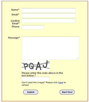
The form on the right is the way to contact me that I provide on my business website.

And, I use SpamArrest to protect messages sent to my personal email account, [email protected].  If you send a message to that public email address, you’ll be sent a message back asking you to click on a link to prove that you’re a human before your email is delivered to me.

These techniques keep the automated mass-mailing messages from appearing in my inboxes.

Of course, determined spammers are going to get their message to you.  Some companies hire workers in poor countries to go through sites and fill out inquiry forms with their spammy messages.  And, other bulk-mail senders respond to the spam challenge messages sent out by services like SpamArrest.

But, the use of forms with a CAPTCHA (those PQAJ characters in the picture at right) and the use of a spam challenge system will stop almost all of those unwanted email messages.

These two methods work.  Asking your customers to cut, paste, and edit your email address leaves a lot of people out.

By |2011-11-20T12:13:38-08:00November 20th, 2011|Web Design|0 Comments

A CAPTCHA that Works

I’ve written about the CAPTCHAs that are getting more and more complex — so complex that soon they’ll be comprehensible only to other computer programs that were created simply to defeat the CAPTCHA. (See my Philippic on bad CAPTCHAs).

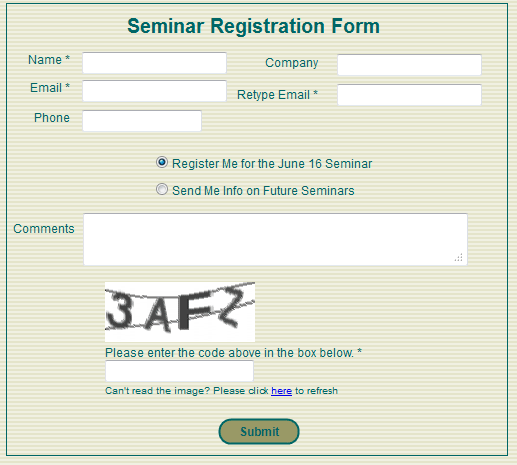
So what is a reasonable way to keep forms from being filled out by automated programs?  Right now I am voting for a simple-to-read CAPTCHA like the one used by San Francisco CPAs Sterck Kulik O’Neill for their business growth strategy seminars.

Business Growth Seminar Registration FormAs Sterck Kulik O’Neill’s web master, I was copied on the email generated by their old, FrontPage form. There was no protection, and spammers frequently filled in the form with their own sales messages.

A couple months ago I switched out the FrontPage form with a clean, simple form built with tools from Simfatic Forms.

Even though I overrode the default settings in the tool and made the CAPTCHA only 4 characters and I decreased the number of interfering lines down to 2, we have received no spam “registrations”.  The form, its field edits, and its simple CAPTCHA are doing their job… and clients are signing up for the seminars without reporting any frustrations or problems.

Of course, the seminar page is a low-priority target for spammers seeking to break into a site.  The information on the form isn’t being posted anywhere on the Internet, it’s just being emailed to the site owner.  So, high-powered spammers with the latest character recognition programs have not yet tried to exploit the form.

And, unfortunately, the CAPTCHAs in Simfatic’s tool are not ADA compliant (people with visual impairment have no option to click to hear the CAPTCHA read to them). So, we have to make sure that there’s a phone number or alternative contact method available for visually challenged people to register.

Still, for the small business web site, the simple CAPTCHA is a good, common-sense solution.  Check it out!

By |2011-06-15T09:55:24-07:00June 15th, 2011|User Interface, Web Design|0 Comments

Don’t Let Your CAPTCHA Get in the Way of Your Business

CAPTCHA examples from LastPass forumsMore and more sites are using CAPTCHAs (Completely Automated Public Turing test to tell Computers and Humans Apart) to keep spammers from registering on web sites, from posting phony comments on blogs, and from generating in-bound breast enhancement messages on forms.

I approve of CAPCHAs in general because they are simple for site users and they cut down on bogus messages, both those publicly posted and those sent to the business owner from a form.

But, enough!

CAPTCHAs are not going to be 100% effective against determined spammers, and efforts to increase the effectiveness of the CAPTCHA test has crossed the line into driving visitors away from doing useful business on some sites.

The CAPTCHAs on the right are full-size copies of ones I copied from my screen this morning when I was registering for a forum on the LastPass web site.  Once I completed the registration form, I would be sent a confirming email to activate my account — another validation step to prove my humanness.  But, I couldn’t get the CAPTCHA right in my first 6 tries.

But, look at these images!  LastPass is doing more than protecting itself from automated comments in its forums, it is driving away real-life users.

These CAPTCHAs are simply too difficult to read.

  • The colored characters are too well camouflaged by both the background color and background pattern.
  • The characters are ambiguously drawn.  8’s and B’s, numeric 0’s and alpha o’s  are possible answers for some of the drawings. How is the user supposed to know which o/0 to choose?
  • There are a variable number of characters in the images.  This makes me wonder if the CAPTCHA-generating routines were working, or if some of the CAPTCHAs are simply faulty and impossible to answer.
  • These CAPTCHAS are particularly hostile to people with visibility issues.  I am not colorblind, but the use of red and green images is plain nasty.  And, unless you blow up your screen, the images are sized for the eyes of the young.

LastPass provides great functionality and responsive customer service, but they’ve joined so many organizations in over-CAPTCHAing their web sites. And, they are far from the worst offenders.

Craigslist is at the top of my list of  CAPTCHA-crazy sites.

Admittedly Craigslist is a very juicy target for spammers and outright criminal frauds.  But, their CAPTCHAs are ridiculous.
CAPTCHAs from Craigslist
The images on the right are ones Craigslist offered to me this afternoon when I was going to post an event for my church — information about the Sunday service.

Before seeing these images, I have had to register with Craigslist. Registration includes providing them with:

  1. An email address which they validate.
  2. A telephone number which they contact with a validation code. The automated message from Craigslist comes into my phone and gives me a numeric PIN which I have to type into a validation page on the Craigslist web site.

So, with Craigslist, I have to have an active account with a checked email address and a validated telephone number.  THEN every time when I want to post an event, I have to type in a CAPTCHA.

And, look.  Some of the CAPTCHAs have foreign-language characters. Others are too blurry for me… maybe an automated character recognition program could read and type in what’s presented by Craigslist, but I can’t!

Time for Dangerous Common Sense for CAPTCHAs

CAPTCHAs are intended to make sure real humans are filling in the forms. But, soon only the character-recognition programs will be able to decode what the CAPTCHA-generating programs have created.

It’s nuts.

Designing your web site design for determined crooks is not good business!  Focusing on the crooks will cost your web site legitimate business.  Pass it on!

By |2011-06-09T12:57:04-07:00June 9th, 2011|User Interface, Web Design|0 Comments

The More You Ask for the Less You Get

Volunteer form scraped from the Internet

Tell Us (too much)!

A friend wanted me to sign-up for her non-profit’s email announcements. I went to the subscription page and happily entered my email address. The form had additional blanks for my home phone number and street address. I didn’t think this non-profit in Oregon needed to have this information, so I ignored those fields and clicked submit.

Wrong.

I was told that those fields were mandatory. So, I left my browser and sent my friend email explaining that I was not going to know what her group was up to because their web form asked for too much information.

Most people wouldn’t have sent the email. They would have just clicked away.

I understand that non-profits and businesses want to know all ways to reach me. They want to add me to their mailing lists, phone trees, and email blasts. But, their desire to reach out and touch me can feel as inappropriately creepy as the clueless lecher at a party.

My friend’s organization’s made a common — and fairly serious — blunder. They focused on their desire for information instead of considering the site visitor’s experience and mood. Sure, the visitor wanted information. But, they didn’t want to become BFF on the first date.

I scraped the graphic for this blog from the web this morning by searching Google for “sign-up form”. One of the top pages had this form which even requires your cell phone number. Geesh!

Businesses have the same problem, of course. Last week I wanted some comparison pricing information and I found myself being asked for my street address before getting the prices.  Huh? No. No, thanks.

E-commerce sites track abandoned shopping carts left behind by people who have picked out items without purchasing them. The more client information required during check-out, the more abandoned carts a business has. Still, marking information as “required” remains irresistible for so many webmasters.

Here’s what to do:
Ask for all the information you want, but require only that information you need to fulfill the current transaction.

Your goal with most sign-up forms is to establish a relationship with a new client or supporter. When the visitor is filling out the form, you’re 90% there. They’ve found you on the Internet, liked your web site, and about to ask you to contact them.  Don’t blow it by being greedy.

When your new contact starts receiving information and service from you, they’ll open up.  They’ll place orders.  They’ll phone you and ask for return calls with answers to their questions.

Being patient and measured when asking for information on the Internet is polite and professional.  It is also the only successful way to build your contact data base.

By |2010-03-11T11:12:41-08:00March 11th, 2010|Web Design|1 Comment
Go to Top